
Color psychology is the scientific study of how colors can impact our emotions and behaviors.
In home office design, understanding the psychological effects of color can help create a space that is both visually appealing and conducive to productivity and focus.
By carefully selecting colors, and combinations of colors, that promote desired emotions and behaviors, we can create a home office that is both functional and visually pleasing that encourages creativity and productivity.
What we’re covering here will explore the role of color psychology in home office design, the feelings and emotions associated with primary, secondary and neutral colors, and how to choose colors that will enhance the atmosphere and productivity of the space.
Real quick, before we get too far into it here, if you want to connect with other remote workers – and make some new friends! – or would love to make your home office space the best join my free private Facebook group, Home Office Hacks here.
What is color psychology and why is it important?
The concept of color psychology is a fascinating one. It studies how colors affect our emotions and perceptions, and why certain colors elicit certain responses from us.[1]
By understanding the science behind how colors can impact our feelings, thoughts, behaviors, and even physiological responses, we can use the knowledge of color psychology in many different kinds of situations, and in particular for home office and interior design.[2]
From interior design to marketing, color plays an important role in influencing how people perceive a product, event, or even a space. By understanding the psychology of color, it can be used to create a powerful impact on an audience and drive results.
Research into color psychology has found that certain colors can influence emotion, cognition, and behavior [3].
A famous example of the use of color psychology is the pink locker room for visiting teams at the University of Iowa’s Kinnick Stadium. Former head football coach Hayden Fry, who earned a psychology degree from Baylor University, decided to put theory to the test and painted everything in the visitor’s locker room pink believing the shade would encourage a more passive mood from visiting opponents.
One thing we didn’t paint black and gold was the stadium’s visitors locker room, which we painted pink. It’s a passive color, and we hoped it would put our opponents in a passive mood. — Hayden Fry [4]
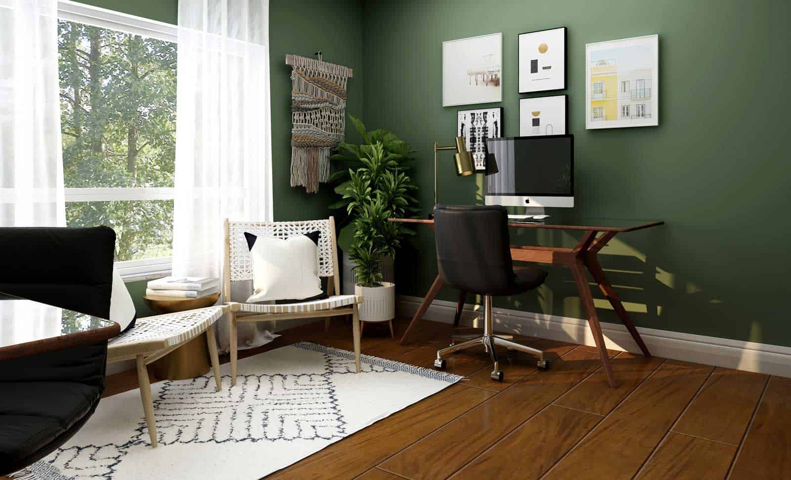
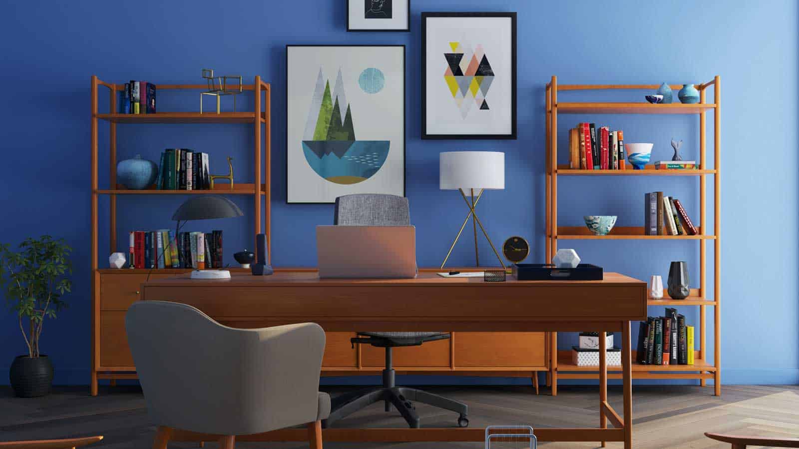
Color psychology is an important element of home office design because, whether we like it or not, the colors in our environment affect our mood and behavior.
Choosing the right colors can help to create an environment that is both comfortable for work and inspiring for creativity.
Utilizing the principles of color psychology, we can create a home office interior design that motivates us, encourages productivity, and sparks our creativity.
With the right balance of vibrant and muted colors, the perfect accent pieces, and a good understanding of how to combine colors and patterns, we can create a home office that reflects our personality and inspires us to succeed.
Exploring the best colors for your home office
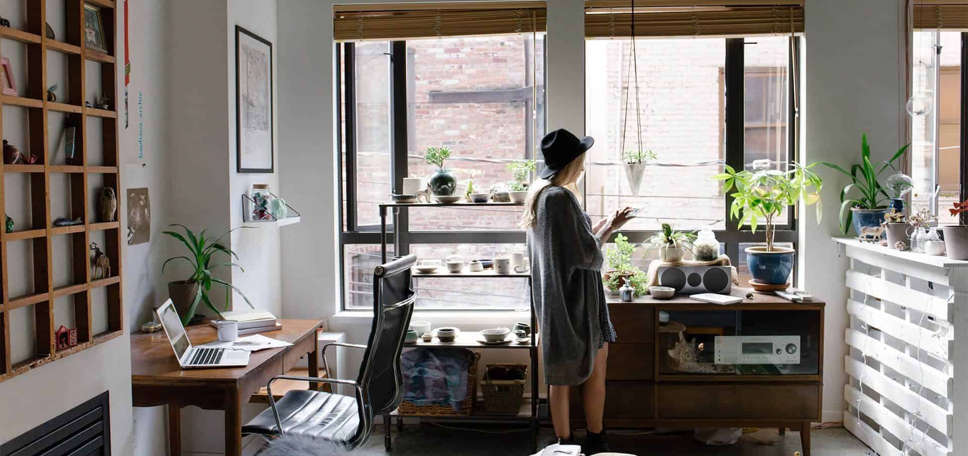
The colors that you choose for your home office can have a significant impact on the atmosphere of the space and your overall productivity and well-being. When it comes to selecting the best colors for your home office, there are a range of factors to consider, including your personal preferences and the type of work you’re doing in the space.
An important factor to keep in mind:
It’s crucial to keep in mind that the best color for your home office doesn’t just depend on what feelings or emotions you’re trying to evoke. It will also depend on your personal preferences and the specific needs of your work.
The best colors for your home office will depend on your personal preferences and the overall atmosphere you want to create in the space when combined with your personal preferences.
In each of these categories you’ve got options so if one type of color doesn’t fit your fancy, there are other options that are sure to be a better fit.
Experiment with different shades and hues to find the combination that works best for you.
 The best home office colors for creativity
The right color scheme can play an important role in inspiring creativity in a home office.
However, certain colors can be detrimental to creativity. Dark and dull colors are not beneficial for a home office environment, whereas bright and vibrant colors increase concentration and spark the imagination. Colors such as brown and gray can create an atmosphere that is perceived as dull by some people and should be avoided when creating an inspiring work area. For others, browns and grays can inspire feelings of being in nature and can be beneficial for creativity.
By incorporating more vibrant colors such as yellow, green, orange, and blue, you can foster an environment that encourages creative thought.
The best colors to use in a home office to inspire creativity will vary depending on the individual, but generally, warm hues like yellow, orange, and red can energize the room and help spark ideas, while cooling tones like blues and greens will create a calming atmosphere, promoting mental clarity and focus. Neutral colors are ideal for the walls, as they can create a blank canvas for the mind to wander.
The best colors for productivity in your home office
According to research in the field of color psychology, certain colors have been found to have a positive impact on productivity and efficiency in a home office setting. Some of the best colors for increasing productivity and efficiency include:
Blue is often associated with feelings of calm and tranquility, making it a good choice for a home office where you need to focus and concentrate.
Green is often associated with nature and growth, and can help promote a sense of balance and harmony.
Yellow is a cheerful and vibrant color that can help increase energy and boost mood.
Purple is often associated with creativity and imagination, making it a good choice for a home office where you need to be creative and innovative.
 The best colors for projecting power
Certain colors are generally associated with feelings of power and authority. Black is often seen as a color of power and sophistication, and is often used in professional settings.
It is also associated with formality and can convey a sense of elegance. Red is often seen as a powerful and bold color, and is often associated with energy, passion, and determination. It can be used to convey a sense of urgency or to grab attention. Gray is often seen as a color of authority and can convey a sense of sophistication and intelligence. It is often used in professional settings and can convey a sense of calm and stability.
A home office that seeks to evoke feelings of power and confidence should steer away from lighter, muted colors such as pastels and shades of white. Instead, rich, dark and deep tones of blues, greens or grays may be better suited to the environment, depending on the desired result. Even rich, bright colors like reds, oranges, and yellows can also help to create an inspiring work environment.
When you combine that with incorporating images or artwork with power colors in your home office in these colors can also encourage feelings of power and confidence.
The best colors for promoting relaxation, tranquility and comfort
If you’re looking to create a relaxing atmosphere in your home office, there are several color options to consider. According to research in the field of color psychology, lighter shades of blue, green, and purple are often associated with feelings of relaxation and comfort. These colors can help to create a soothing and peaceful atmosphere, which can help to reduce stress and anxiety.
Soft, pastel shades such as pinks, light blues, and other pastels can also create a calming atmosphere that promotes relaxation and comfort. These colors can help to create a sense of peace and tranquility, allowing for better focus and productivity. Additionally, soft colors can help to create an inviting environment that encourages creativity and imagination.
The best colors for promoting joy and happiness in your home office
According to color psychology, certain colors are associated with different emotions and can have an impact on your mood. Here are a few colors that are often associated with joy and happiness:
Yellow: Yellow is a bright, cheerful color that is often associated with feelings of happiness, joy, and warmth. It is also thought to increase feelings of optimism and creativity.
Orange: Orange is another bright, cheerful color that is often associated with happiness and energy. It is also thought to increase feelings of enthusiasm and excitement.
Green: Green is a calming color that is often associated with nature and relaxation. It is also thought to increase feelings of balance and harmony.
Blue: Blue is a calming color that is often associated with tranquility and relaxation. It is also thought to increase feelings of calmness and serenity.
 The best colors for promoting feelings of spaciousness
Colors can have a significant impact on the atmosphere of a room, and certain shades can create the illusion of spaciousness. If you’re looking to make your home office feel larger and more open, here are some color options to consider:
Bright whites: A coat of bright white paint can reflect light and make a room feel more open and airy.
Pale pastels: Soft, pastel shades like pale pink, blue, and green can create a feeling of spaciousness, as they are often associated with lightness and openness.
Bold hues: Choosing bright, bold colors for your walls or accents can draw the eye upwards and make a room feel taller, giving the impression of more space.
When you incorporate colors like these with mirrors, you can really make your home office feel like it’s opening up!
The best colors for promoting feelings of wealth & luxury
Colors can have a significant impact on the atmosphere of a room, and certain shades are often associated with feelings of luxury and wealth. If you want to create a luxurious atmosphere in your home office, here are some color options to consider:
Rich metallic shades: Gold and silver are both classic choices that can add a sense of richness and sophistication to a space.
Royal hues: Purple is often associated with royalty and luxury, and can add a regal touch to your home office.
Classic black: Black is a timeless color that is often associated with sophistication and can add a sense of drama to a room.
It’s important to keep in mind that creating a luxurious atmosphere in your home office is not just about the colors you choose. You can also incorporate luxurious materials and finishes, such as marble, leather, and velvet, to add a sense of opulence to the space.

What are the feelings & emotions behind the different color groups?
Colors can have a powerful influence on our emotions and feelings. Different color groups, such as primary, secondary, and neutral, are often associated with specific emotions and can create different atmospheres in a space. By understanding the emotional associations of various colors, we can use color to impact the mood and atmosphere of a room. Let’s explore the feelings and emotions behind different color groups and how they can be used in design to create specific atmospheres and moods.
Primary colors
Primary colors can have a strong influence on the mood and atmosphere of a home office. When you use primary colors in your home office design, they can have a powerful effect on the feelings they evoke and the atmosphere they create in your home office space. When you strategically pair hues of primary colors, appropriately balanced with neutral tones as accent colors, you can really create a remarkable home office space.
Red
Red is often associated with strong emotions, both positive and negative. On the positive side, red can symbolize love, passion, and desire, making it a popular choice for Valentine’s Day and other romantic occasions. It is also associated with energy, determination, and ambition, making it a good choice for home offices and other creative spaces. However, red can also be associated with anger, aggression, and danger, and can be overpowering when used excessively in smaller rooms. It is important to consider the context and purpose of a space before using red as a primary color, as it can have a strong impact on the emotional atmosphere of a room.
Yellow
The color yellow is known for its vibrant and cheerful energy, often evoking feelings of joy and optimism. Its warm and lively nature makes it a popular choice for adding a dash of color and cheer to a space. It is the brightest color in the spectrum and is known for its ability to bring warmth and happiness to a space. Yellow can be particularly effective in spaces that don’t receive a lot of natural light, as it can help to create a sense of warmth and cheer. This versatile color can be used in a variety of rooms, including the kitchen, dining room, or living room, to create a welcoming and inviting atmosphere. It can also be used in a nursery or other space intended for children to create a playful and cozy design. However, it is important to be mindful of the intensity of the yellow hue, as a bright shade may overpower the rest of the room and potentially cause feelings of discomfort.
Blue
Blue is a strong hue in color psychology and is often associated with feelings of calmness and tranquility. In the natural world, we often see the color blue in the form of the sky and water, which can evoke feelings of relaxation and serenity. The calming and peaceful nature of blue is frequently used in interior design to create a relaxing atmosphere. When used in the right amount, blue can add a sense of relaxation and peace to a space, making it feel more calming and tranquil. Deep, bold shades of blue like navy (which we will talk more about below) are linked to qualities such as trust, peace, loyalty, and success, while lighter shades of blue can have a seemingly instant calming effect. Incorporating blue into your home office design can help to bring a sense of calm and balance to your daily life, just don’t over-do it.
Secondary colors
Secondary colors, created by combining two primary colors, can also have a powerful impact on the mood and atmosphere of a home office. It’s vital to take into consideration the effects of different shades and hues of secondary colors, as well as the balance between neutral tones and pops of color, in order to create a cohesive and harmonious home office design.[5]
Orange
Orange is a vibrant and lively color that is often associated with happiness, creativity, and enthusiasm. It is often associated with tropical and sunny environments, and is often used in interior design to add warmth and cheer to a space. While some people may not enjoy the color orange as much as others, it is becoming more popular among consumers and is being used more frequently in interior design. Orange can stimulate the appetite and add a sense of adventure to a space, but it is important to use it in the right amount to avoid overwhelming a room. Softer shades of orange, such as apricot and coral, can create a more relaxed and calming atmosphere. Overall, orange is a versatile and lively color that can add warmth and cheer to any space.
Green
Green is a refreshing and calming color that is often associated with nature, growth, and purity. It is a versatile color that can be used in any room in the house and is particularly well-suited for bringing a sense of nature and tranquility into a space. There is a wide variety of shades of green to choose from for your hom office design needs, including bright and vibrant turquoise, muted olive, and forest green. This range of options makes it easy to find the perfect shade of green to fit your style and needs. Whether you want to create a lively and energetic atmosphere with a bright green accent wall or a more calming and natural feel with muted olive tones, there is a shade of green that will suit your needs.Whether you want to use green as a wall color, wallpaper, or as an accent, it is a great choice for creating a fresh and natural atmosphere in your home.
Purple
Purple is a rich and luxurious color that is often associated with creativity, nobility, ambition, and wealth. It is a versatile color that can be used in a variety of settings to create different moods and atmospheres. For example, light shades of purple can add a feminine touch to a room, while darker shades can create a more masculine feeling. Purple is also a great color for making a strong first impression, as it embodies a sense of luxury and sophistication. Whether you use it as an accent color or as a primary color, purple can elevate the atmosphere of a room and give it a unique and stylish look.
Cyan
According to color psychology theory, the color cyan is often associated with feelings of calm, serenity, and tranquility. It’s a cool and refreshing color that is reminiscent of clear blue skies and tranquil bodies of water, making it a popular choice for creating a relaxing and peaceful atmosphere. In interior design, cyan can be used to bring a sense of openness and airiness to a space, especially when paired with light and neutral colors. It is also often used in healthcare settings to promote feelings of calm and well-being. Overall, the color cyan is a versatile and calming choice that can help to create a peaceful and relaxing environment.
Magenta
Color psychology suggests that magenta evokes emotions of excitement, passion, and energy. This bold and vibrant hue is often used to add drama and intensity to a space. In interior design, magenta can be a striking addition to a room, creating a lively and energetic atmosphere. It is also commonly employed in advertising and marketing to capture attention and generate excitement. It is essential to use magenta cautiously, as it can be overwhelming when used in excess. When used appropriately, magenta can infuse a space with energy and excitement, making it feel more vibrant and lively.
Neutrals
Neutral colors can have a significant impact on the mood and atmosphere of a home office and are a popular choice for home office setups and design due to their ability to create a calming and professional atmosphere. These hues are often used to create a sense of simplicity and clarity in a home office, helping to reduce distractions and promote productivity. When paired with spots of color, neutral tones can also provide a sense of balance and harmony in a home office, creating a comfortable and stylish space for work.
Black
Color psychology suggests that black is often associated with sophistication, power, and formality. This neutral hue can be used in interior design to bring a touch of elegance and drama to a space, particularly when paired with other neutral colors such as white or grey. It is crucial to use black sparingly, as excessive use can make a room feel heavy and oppressive. When used appropriately, black can add a sense of sophistication and drama to a space, making it feel more elegant and formal.
White
According to research in the field of color psychology, the color white is often associated with feelings of purity, innocence, and cleanliness. As a neutral color, it is frequently used to create a sense of clarity and simplicity in design. When used in interior design, white can create a fresh and modern atmosphere, particularly when paired with other neutral colors such as black or gray. It is also commonly used in healthcare settings to create a sense of cleanliness and sterility. However, it is important to use white sparingly, as it can make a space feel clinical and cold when used excessively. When used appropriately, white can bring a sense of purity and simplicity to a space and make it feel clean and fresh.
Gray
The color gray is associated with stability, reliability, and professionalism, according to research in the field of color psychology. As a neutral color, it is often used to create balance and neutrality in design. When used in interior design, gray can create a calming and sophisticated atmosphere, particularly when paired with other neutral colors such as white or black. It is also frequently employed in corporate settings to convey professionalism and dependability. However, it is essential to use gray sparingly, as it can make a space feel dull and uninteresting when used excessively. When used appropriately, gray can bring a sense of stability and professionalism to a space and create a calming and sophisticated atmosphere.
Brown
Brown is often associated with feelings of warmth, comfort, and stability. It is a neutral color that is often used to create a sense of security and reliability. Brown, when combined with beige or cream, is a popular color in interior design because it helps create a comfortable and inviting environment. It is also often used in natural settings, such as wood and earth tones, to create a sense of connection to the outdoors. However, it is important to use brown sparingly, as it can make a space feel heavy and oppressive when used too much. When used in the right amount, brown can add a sense of warmth and comfort to a space and create a stable and welcoming atmosphere.
Navy
Navy is often associated with feelings of sophistication, authority, and intelligence. It is a deep and rich neutral color that is often used to create a sense of professionalism and gravitas. In interior design, navy can be used to create a formal and sophisticated atmosphere, especially when paired with other neutral colors like black or grey. It is also often used in corporate settings to convey a sense of authority and intelligence. Nevertheless, navy should be used cautiously as too much of it can create a heavy and oppressive atmosphere. With the right amount of navy, you can achieve a sophisticated and authoritative look that will create a formal and professional ambience.
Beige
Bbeige is often associated with feelings of calm, comfort, and neutrality, according to research in the field of color psychology. It is a soft and subtle neutral hue that is frequently used to create a sense of tranquility and relaxation in design. Using beige in interior design can add a warmth and coziness to any room, especially if it is combined with other neutrals like white or grey. It is also used in nature-inspired settings, like earthy tones and wood, making it feel connected to the outdoors. But it is important to be conservative when using beige, since too much of it can make a room seem tedious and boring. When used correctly, beige can provide a soothing and comfortable ambiance, creating an inviting and pleasant environment.
Next Steps
Want to connect with other people who work from home who are creating the most amazing home offices and get more tips, tricks and hacks on how to make your home office setup the best it can be?
Join my brand new free private Facebook group, Home Office Hacks to connect with other home office hackers to make your space the best!
- https://www.color-meanings.com/color-psychology-how-colors-affect-your-everyday-life/
- https://www.color-meanings.com/psychological-effects-color-interior-design
- https://designmodo.com/color-psychology-web-design/
- Hayden Fry: A High Porch Picnic, p. 102
- https://www.adobe.com/creativecloud/design/discover/secondary-colors.html